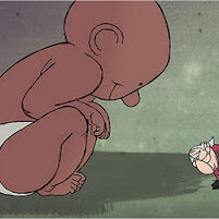
At a time when each month brings news of another NY animation talent departing for the West Coast (we just waved goodbye to the talented animator/director Dan Forgione, for instance), it’s a gift to our community that we have Tim and Mike Rauch (pictured above, drawn by Tim) making intelligent and sensitive films out of their virtual Brooklyn studio.
Recently, when one of their new Storycorp animated films, Danny and Annie, debuted on TV and online (note: you can see all five of their StoryCorp films by clicking here), I was tempted to write about it straight and away, but I’m glad I didn’t. By waiting I had the opportunity to look at their five Storycorp films as a whole body of work.
The Rauch brothers are among the most exacting filmmakers working in animation today. They produce beautifully crafted films to an ever increasing set of self-imposed standards. After producing the first two Storycorp films, Germans in the Woods and Q & A, largely as independents, their first official, commissioned Storycorp films followed, putting the brothers on a schedule that required more than one film a year. Big boosters of the NY animation scene, they wanted to work with as much local talent as possible. To that end, they wisely snatched up talented newcomer David Sheahan. But, they were also willing to pull in out-of-town collaborators such as the former Spumco background artists Bill Wray and Jim Smith, both of whose styles are compatible with the types of textured art that the Rauch’s featured in Q & A.
Once I had a chance to examine and appreciate the three new films, Danny and Annie, Icing on the Cake, and The Human Voice, I could better understand their artistic ambitions. While the character designs vary from one short to another short, Tim’s delicate animation and the brothers’ directing style unifies the films, squeezing them neatly into a cohesive series.
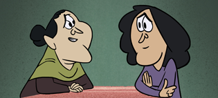 A still from Icing on the Cake.
Comparing the three new films to the first two, I noticed that the two original pieces were much more filmic or cinematic with pans and camera moves, and I found that I missed those touches in the later shorts. The new approach has longer scenes, so the viewing experience is more like watching moving layouts. All this is done with confidence and it’s a bold choice.
Danny and Annie is the film that has gotten the most attention with its very tender and heartbreaking audio track. While I’m not certain the challenging character design of the piece provides the appropriate accompaniment, it is well drawn and lovingly animated.
A much more literal approach is taken on the most recent soundtracks, a curious direction when the Storycorp soundtracks are already moving and powerful without any visuals. In The Icing on the Cake and Danny and Annie what we see on the screen is generally a literal rendering of what’s taking place. There was more abstraction in the visuals and locations created for Germans in the Woods and Q & A. Germans in the Woods depicted a WWII vet’s saddest memory of the war in a very dream-like fashion, allowing the audio track to soar to even higher emotional heights as a film. Q & A took the audio of a son interviewing a mother and started out with a literal scene of their time in the recording studio before giving the material room to breathe in a surreal landscape for the rest of the film.
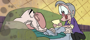 The title card from Danny and Annie.
Still, there’s a lot to like in The Icing on the Cake and Danny and Annie. The razzle-dazzle factor is high. They look like expensive productions, regardless of the limited budget. The layouts are Hollywood perfect and each transition of time and place in the stories is seamless. I especially like the condensed time effect used in The Icing on the Cake to simplify the action of characters moving across the spaces. Master filmmaker Konstantin Bronzit used a similar technique in his 1994 short Switchcraft.
The backgrounds in The Icing on the Cake and Danny and Annie are lovely and most of the time the clean spare look works really well. I love the way they depict the office space in The Icing on the Cake, for instance. It works a little less well when it comes to the backgrounds in the Mexican American’s family home, where the minimalist treatment, as beautiful as it is, gives their home interiors an unintentional unlived-in effect.
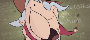
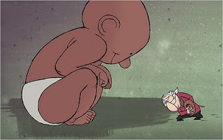 A pair of stills from The Human Voice.
I’m absolutely wild about The Human Voice. I think it vividly captures what I loved about the first two Storycorp films: a visual abstraction that adds so much to the storytelling. The animation of Studs Terkel’s rant in this film is simply wonderful (in my opinion, Tim is one of the best character animators since Paul Fierlinger). And while it contains the lightest subject matter of all five films, I found it the most moving.
Kudos to the Rauch Brothers and their collaborators for putting all their blood, sweat, inspiration, and sacrifice into making these wonderful and important animations and setting a new standard of excellence for the next generation behind them.

